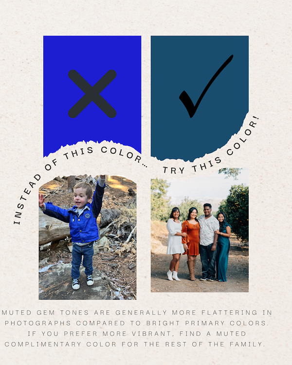
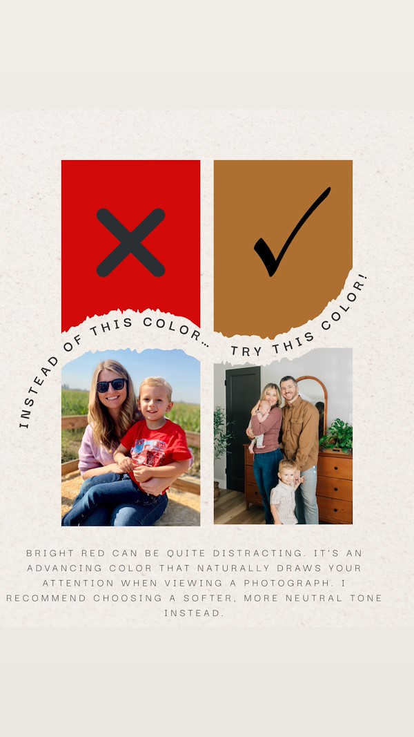
Instead of Red, Try a more Muted Tone
I love color and finding colors that go well together. It is amazing how color choices can really affect the outcome of the photographs. I find red tends to be bold and if your reds are not all the same shade, it can be distracting to the eye.
For the "Instead of" pictures, I am using photographs of myself or my kids. This post is not to make anyone feel like they cannot wear red, just be strategic in how you do it.
If you love red, I suggest making it an accessory or using a deeper shade such as maroon, burgundy, or dark orange. Darker, more muted earth tones make the person stand out in the photographs instead of the clothing color.
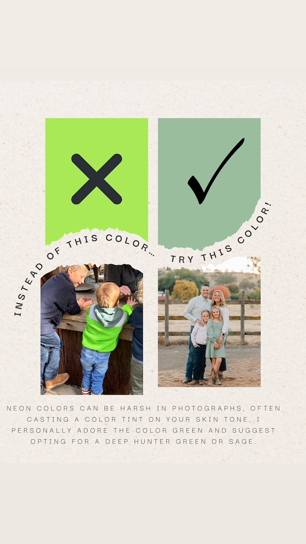
Below are two more color swap suggestions.
Type something